the story · 2026-06-28
Models keep ruining my designs, so I built a benchmark
Here's how I design UIs: badly, with help. I scour the internet for reference material, dribbble, real sites, screenshots hoarded in a folder, and when something clicks I paste the image into my coding agent and say "make it look like this". Sometimes the result is scary good. And sometimes it's… off. Almost always, the thing that's off is the font. The model looks at a screenshot set in Futura, confidently declares it Montserrat, and the whole design just dies right there. Wrong font, wrong vibe, wrong everything.
That happened enough times that I wanted a number for it. fontbench is that number. It's a proxy for one very specific workflow: can this model actually see the typeface in my reference image, or is it guessing, and if it accidentally measures something deeper about fine-grained vision, great, I'll take the second-order effects too.
The task
One rendered image, four candidate families, pick one. The model answers with a single letter and a confidence as strict JSON, so random guessing gets you25%. The wrong options come from the same category (sans with sans, mono with mono) so theres no freebies. 21 families, 126 specimens, and every label is exact because I rendered every image myself from the actual font file.
How do you even tell fonts apart?
The same way a birder tells sparrows apart: stop looking at the bird, start looking at details. Terminals, bowls, apertures, the leg of an R. The stuff in this chart:
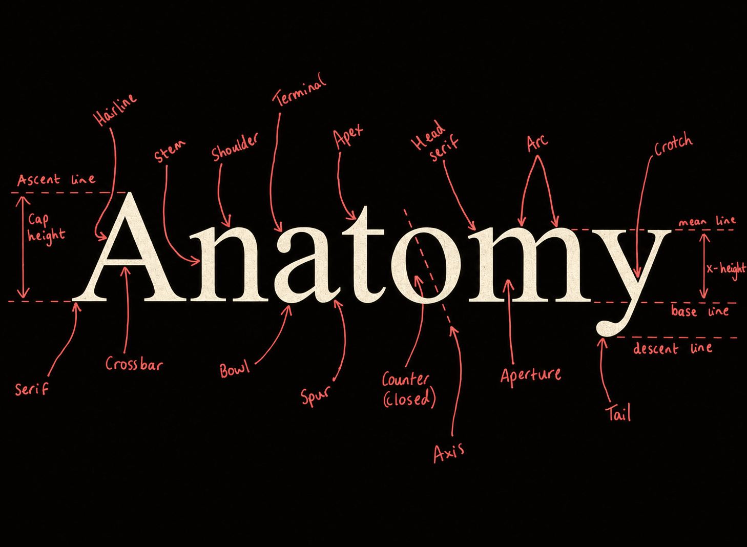
Roughly, every guess loops through something like this:
- double-story
a… so not a geometric sans - straight leg on the
R, flat-cut terminals - squarish curves, tight aperture on the
g - → Space Grotesk. confidence 0.83
Here's the catch: vision encoders are trained to do the exact opposite. They compress an image down to "some text on a background" and throw the high-frequency detail away, and that detail is literally the whole game here. Which is what makes this fun to test.
Two datasets, one public, one not
There's dev-open: 15 families pulled from Google Fonts, fully reproducible, anyone can rebuild it from the repo with one command. And then there's private-mixed, the one the leaderboard actually runs on, which adds 6 licensed families I own: Arial, Helvetica Neue, Futura, Avenir Next, Proxima Nova, Times New Roman.
Why bother with the private half? Two reasons. First, these are the fonts that actually show up in the reference images I steal from. A benchmark of only free Google Fonts would be testing a world I dont design in. Second, contamination. Every specimen here is rendered fresh from the font file on my machine and has never been published anywhere, so no model has seen these exact pixels in training. The private font files themselves stay gitignored and never leave my machine; the sandbox only ever sees anonymous PNGs.
Why the Cursor SDK (the money part)
Honest answer: the main reason every model runs through the Cursor SDK instead of a stricter purpose-built harness is that I dont have API money. Vision calls are priced per image, and a serious benchmark run costs real dollars that I, a person with a Cursor subscription and not much else, do not have. So the SDK is the harness, running inside an offline E2B sandbox. The sandbox gets the images and the questions, never the answer key, and the licensed font files never leave my machine.
This has consequences. Cursor sits between me and the models, it handles the routing and how images get packaged. So read the board as a Cursor SDK leaderboard, not a clean comparison of raw OpenAI vs Anthropic vs Google endpoints. And since billing happens inside my subscription there's no dollar column. Tokens are the closest honest proxy.
About that sample size
Each model saw 60 items: 3 random draws of 20, same items for everyone. That's it. Again, cost. With n=60 a model scoring 45% carries a margin of error around ±12 points, and per-seed accuracy already swings by twenty. So dont read the board as "gemini beats composer", the gaps between neighbours are mostly noise. The gap between the whole pack and the 25% chance line. That one is real.
So what is this, actually
Not a ranking. More like an existence proof. The question fontbench actually answers is: when I paste a reference into an agent, did any of the glyph detail survive the vision encoder at all? Right now the answer is "barely". The best model gets 45%, meaningfully above chance, nowhere near a type nerd, and this is the easy version with multiple choice. In my real workflow theres no four options, the model has to name the font cold. No wonder my designs kept coming back in the wrong typeface.
Reproduce
Build the data with bun run dataset:all, then evaluate a model with bun run e2b:eval -- --model gemini-3.1-pro --limit 20.